Responsive Web Design

Discover the Power of a Responsive Web Design

If you own a website, it’s impossible to tell which devices your clients are going to use to access it. And if you want all of them to have a seamless user experience, you need to make your website as responsive as possible. Part of our web design services here at Marvel Marketing entails the creation of highly responsive sites that automatically adjust to all screen sizes. Our brilliant team of web designers are committed to helping you unlock the power of a responsive web design. Let’s schedule a consultation today so that we can discuss ways we can optimize your website’s responsiveness. 

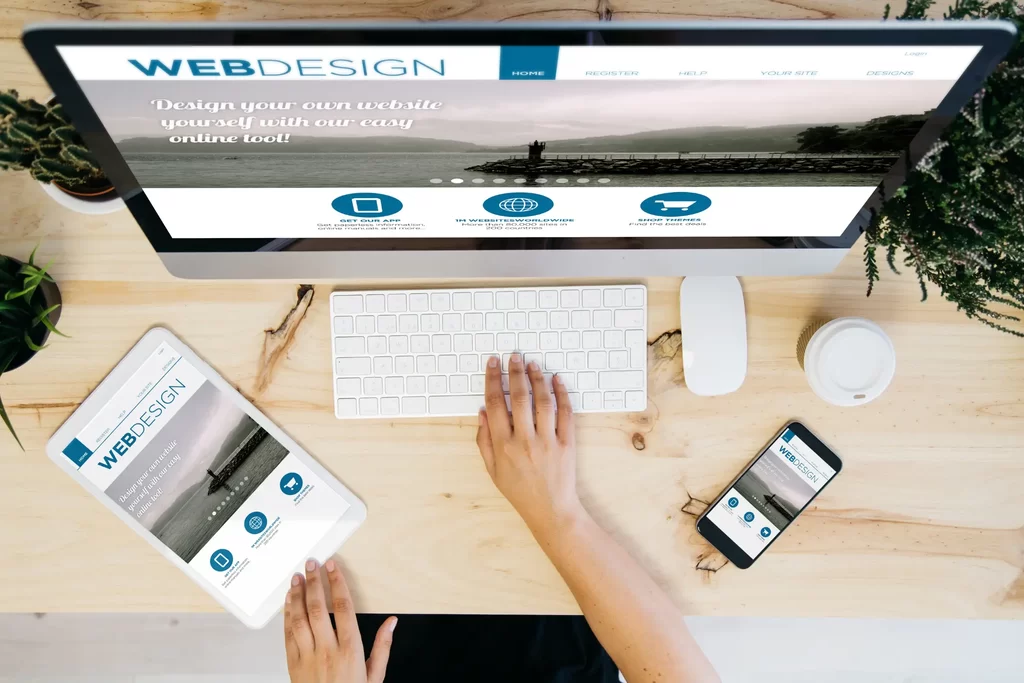
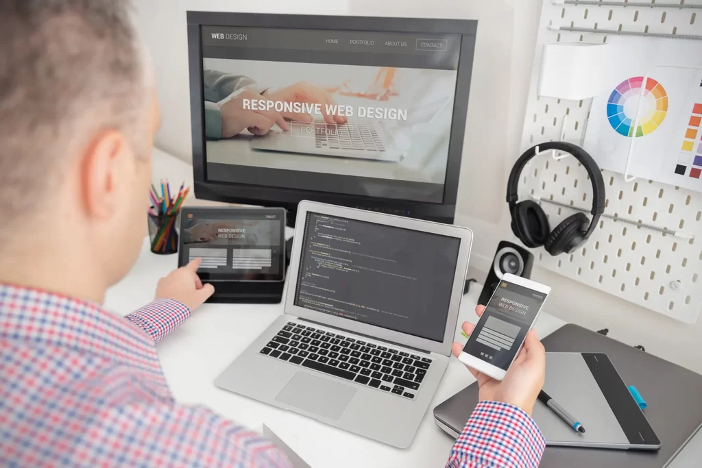
What is a Responsive Web Design?

A responsive web design is an innovative approach to creating websites that automatically adjust and adapt to various screen sizes and devices. It ensures that the site’s layout, images, and content dynamically respond to the user’s screen, whether it’s a desktop computer, tablet, or smartphone. This fluidity allows for an optimal and seamless user experience, eliminating the need to create separate websites for different devices. With responsive web design, users can effortlessly navigate through the website, read content, and interact with elements, all while enjoying a consistent and visually appealing interface.

What is a Responsive Web Design

7 Characteristics of a Responsive Web Design

Characteristics of a Responsive Web Design

There are a few things that make up a responsive web design. Allow us to highlight some of these characteristics so that you can evaluate how responsive your current web design is. 

  1. Fluid Grid Layout: Responsive web design utilizes a flexible grid system that automatically adjusts the website’s layout based on the screen size. This ensures that content and elements proportionally scale up or down, maintaining a visually pleasing and consistent appearance.
  2. Media Queries: Media queries enable the website to detect the user’s device and screen size, allowing it to apply specific styles and adapt the layout accordingly. This technique ensures that the website optimally responds to different devices and orientations.
  1. Flexible Images and Media: Responsive web design incorporates fluid images and media, which automatically resize and adjust to fit various screen resolutions. This prevents images from appearing too large or too small, enhancing the overall user experience.
  2. Touch-Friendly Navigation: Responsive websites consider touch navigation, making buttons and interactive elements easy to tap and interact with on touchscreens. This improves user-friendliness and encourages seamless interactions.
  3. Cross-Browser Compatibility: A well-designed responsive website functions consistently across different web browsers, ensuring that users have a uniform experience regardless of their browser preferences.
  4. Fast Loading Times: Responsive web design emphasizes optimizing loading times for all devices, including mobile. This is crucial for user satisfaction, search engine rankings, and reducing bounce rates.
  5. Adaptable Typography: The typography in a responsive design adjusts to different screen sizes, maintaining legibility and ensuring a pleasing reading experience.

The 3 Types of Responsive Web Design Layouts

As an award-winning web design agency, Marvel Marketing considers educating our clients as one of our crucial duties. Still, on responsive web designs, you should know that there are different layouts. Familiarizing yourself with these varying layouts is crucial in helping you pick a type that resonates with the behaviors of your target audience. 

Here are the three most popular types of responsive web design layouts

  1. Fluid Layout They use relative units like percentages for width and height, allowing elements to resize proportionally based on the screen size. This type of layout smoothly adapts to different devices, maintaining the same relative spacing between elements regardless of the screen resolution.
  1. Fixed Layout – They have a set width and do not change based on the screen size. While they may work well on specific devices or screen sizes, they may cause usability issues on smaller screens, as the content does not adjust to fit the available space.
  2. Adaptive Layout – They use predefined breakpoints to change the design based on specific screen sizes. Different CSS stylesheets are applied at these breakpoints, allowing the website to adapt to different device categories (e.g., mobile, tablet, desktop). It provides more control over the design at various screen sizes but requires more development effort

There are other types such as one-page or multi-column layouts. Don’t worry if this seems so overwhelming. During the consultation, our project managers will explain everything you need to know.

3 Types of Responsive Web Design Layouts

Benefits of a Responsive Web Design

From the perspective of a website owner, you may not really understand the benefits of having a responsive website. But trust us, your clients do! If your site is unresponsive, visitors find it hard to access the content, and that results in high bounce rates. On the other side of the spectrum, there are plenty of benefits you can get from having a responsive web design, which includes; 

Enhanced User Experience

A responsive website automatically adjusts its layout and content, providing a seamless browsing experience across all devices. Whether your visitors access your site from a desktop, laptop, tablet, or smartphone, they will enjoy a consistent and user-friendly interface.

Increased Mobile Traffic

With the rise in mobile device usage, a responsive web design ensures that your website attracts and retains mobile users. By catering to the growing mobile audience, you can tap into a larger pool of potential customers.

Boosted SEO Rankings

Search engines like Google prioritize mobile-friendly websites in their search results. Embracing responsive web design can positively impact your SEO rankings, leading to higher visibility and more organic traffic.

Increased Conversion Rates

A positive user experience is directly linked to higher conversion rates. When visitors can easily navigate your website on any device, they are more likely to engage with your content and take desired actions, such as making a purchase or submitting a contact form.

Faster Page Loading Speeds

Responsive web design often incorporates optimized images and efficient coding practices, leading to faster loading times. As loading speed is a critical factor in user satisfaction and search engine rankings, a responsive website can positively impact your site's performance.

A Competitive Advantage

In today's competitive digital landscape, staying ahead of the curve is crucial. By embracing responsive web design, you gain a competitive edge over businesses that haven't optimized their websites for different devices. Your ability to cater to a broader audience effectively sets you apart from the competition.

What are you waiting for? Contact us today for a responsive web design and experience all the above benefits. 

What’s the Difference Between a Responsive Website and a Mobile Website?

A responsive website is a single site that automatically adjusts its layout and content to fit various screen sizes, offering a seamless user experience across devices, including desktops, tablets, and smartphones. On the other hand, a mobile website is a separate entity designed specifically for mobile devices, often featuring a simplified version of the main website with limited content and functionality. 

While a responsive website ensures consistent branding and easier maintenance, a mobile website allows for greater control over the mobile user experience. However, with the rise of responsive web design and the increasing prevalence of mobile devices, responsive websites have become the preferred choice for businesses looking to provide a user-friendly experience on all platforms.

Difference Between a Responsive Website and a Mobile Website

Our Process of Creating a Responsive Web Design

At Marvel Marketing, we don’t just create responsive web designs out of the blue. There is a detailed process that we follow which ensures our clients get a design that reflects their goals. Here is an overview of how we create responsive web designs. 

Consultation

Our process begins with a thorough discovery phase where we collaborate closely with you to understand your goals, target audience, and unique brand identity. We conduct in-depth discussions to gather insights into your business objectives, competitors, and any specific features you want to include.

Strategy and Planning

With the gathered information, our expert team strategizes the best approach for your responsive website. We create a detailed plan that outlines the site's structure, navigation, content hierarchy, and design elements. This step ensures that the responsive design aligns with your business objectives and user expectations.

Wireframing and Prototyping

Once the strategy is approved, we move on to crafting wireframes and interactive prototypes. This stage helps visualize the layout and functionality of the responsive design across different devices. You'll have the opportunity to review and provide feedback to ensure we're on the right track.

Design and Development

Our talented designers work their magic to create stunning visuals that embody your brand identity while ensuring a seamless user experience. As the designs take shape, our skilled developers bring them to life, using the latest technologies and coding practices to build a fully responsive website.

Deployment and Launch

Once we have your approval and the final rounds of testing are complete, we deploy your responsive website on your desired hosting platform. We manage every aspect of the launch to ensure a smooth transition from development to the live environment.

Ongoing Support and Maintenance

Our relationship doesn't end with the launch. We offer comprehensive support and maintenance packages to ensure your responsive website stays updated, secure, and optimized for peak performance.

An Agency Committed to Creating Responsive Web Designs (Why Choose Us)

The modern consumer prefers to interact with a responsive web design. If you’re still using a basic design that’s only optimized for computers, then you’re missing out on lots of sales opportunities. When you hire Marvel Marketing, we promise to deliver a responsive web design that will boost your traffic and conversions. Here are a couple more reasons why you should partner with us; 

Unrivaled Expertise in Responsive Web Design

Our team of skilled designers and developers possess extensive experience in crafting cutting-edge responsive websites. We stay up-to-date with the latest design trends and development practices, ensuring your website performs flawlessly across all devices.

Tailored Solutions for Your Unique Needs

We believe in the power of personalization. Every project we undertake begins with a deep understanding of your business goals, target audience, and brand identity. This allows us to tailor a responsive web design solution that aligns perfectly with your unique requirements.

We Create Captivating User Experiences

User experience is at the core of our design philosophy. We create intuitive, user-friendly interfaces that engage visitors and lead them seamlessly through your website. With our responsive designs, your audience will enjoy a consistent and delightful experience across desktops, tablets, and smartphones.

Our Web Designs are Also SEO-Optimized

Your website’s visibility is essential, and we optimize every aspect of our responsive designs to rank well on search engines. From mobile-friendly layouts to lightning-fast loading speeds, our SEO-centric approach ensures your site attracts organic traffic and gains a competitive edge.

We Pay Keen Attention to Aesthetics

At Marvel Marketing, we know that beauty and functionality go hand in hand. Our designers skillfully blend captivating aesthetics with a purposeful layout, ensuring that every element serves a specific goal – whether it’s driving conversions, encouraging engagement, or conveying your brand’s story.

Seamless Integration of Content

Content is the backbone of any website, and we know how to make it shine. Our experts seamlessly integrate your content into the responsive design, ensuring that it resonates with your audience and communicates your message effectively.

Get My FREE Proposal